Team Productivity Dashboards: 9 Metrics
Managers Should Actually Track
2026-10-08
•
Author: TrackForce Team
•
~1 min read
•
Updated October 8, 2026
- What Is a Team Productivity Dashboard?
- What Software for Tracking Team Productivity in Dashboards Should Show
- —1. Outcome completion
- —
- —2. Quality and rework
- —
- —3. On-time delivery
- —
- —4. Cycle time
- —
- —5. Workload balance
- —
- —6. Focus time and work fragmentation
- —
- —7. Active and idle time trends
- —
- —8. Application and website use
- —
- —9. Customer or business impact
- What Software for Tracking Team Productivity in Dashboards Should Avoid
- How to Design a Dashboard Managers Will Use
- —Start with decisions
- —
- —Show trends and comparisons
- —
- —Pair leading and lagging indicators
- —
- —Define every metric
- —
- —Keep access proportionate
- How to Choose Software for Tracking Team Productivity in Dashboards
- How TrackForce Supports Team Productivity Dashboards
- Build a Dashboard for Decisions, Not Surveillance
- Frequently Asked Questions
- —What should a team productivity dashboard include?
- —
- —What is the best metric for team productivity?
- —
- —Can active time measure productivity?
- —
- —How often should managers review productivity dashboards?
- —
- —What should software for tracking team productivity in dashboards avoid?
The best software for tracking team productivity in dashboards should answer management questions, not simply display more employee data. A useful dashboard shows whether important work is moving, whether quality is holding, where workloads are becoming unsafe and which processes are slowing the team down.
Many dashboards start with easy signals such as hours online, active time, messages or applications opened. These provide context but do not prove that valuable work was completed. Visible activity can rise while deadlines slip.
Managers therefore need a balanced view of outcomes, quality, speed, capacity and work patterns. The following nine metrics create that view without reducing employees to an activity score.
What Is a Team Productivity Dashboard?
A team productivity dashboard brings selected work metrics into one view so a manager can identify trends, exceptions and areas that need investigation. It may combine task or project data with working hours, attendance, application use, workload and business results.
The dashboard should help a manager ask better questions, not make the final performance decision. If delivery slows, workload data may reveal excessive assignments, tool switching or an external dependency.
This distinction matters when choosing software for tracking team productivity in dashboards. The system should connect activity with context and outcomes rather than treating keyboard or mouse activity as productivity.
What Software for Tracking Team Productivity in Dashboards Should Show
| Metric | What it tells a manager | Important guardrail |
| Outcome completion | Whether committed work was delivered | Weight work by value and complexity |
| Quality and rework | Whether output meets the required standard | Do not reward speed that creates errors |
| On-time delivery | Whether commitments are reliable | Record dependencies and changed priorities |
| Cycle time | How long work takes from start to finish | Compare similar work types |
| Workload balance | Whether assignments match capacity | Review complexity, not task count alone |
| Focus and fragmentation | Whether interruptions are disrupting work | Treat it as a process signal |
| Active and idle trends | How recorded computer activity changes | Never use it as a verdict by itself |
| Tool and application use | Where digital work time is going | Classify tools by role and purpose |
| Customer or business impact | Whether work creates useful results | Choose role-specific measures |
1. Outcome completion
Start with the work the team committed to complete. The measure might be projects delivered, cases resolved, orders processed, campaigns launched or milestones accepted.
A simple formula is:
Outcome completion rate = completed agreed outcomes / due outcomes × 100
Task count can mislead because ten routine tasks may create less value than one complex deliverable. Add priority or complexity where possible. TrackForce's guide to employee performance metrics explains why measurement should connect activity to results.
2. Quality and rework
Productivity falls when completed work repeatedly returns for correction. Track defect rate, first-pass approval, reopened cases, customer complaints or revision rounds according to the team's role.
Rework rate = items returned for correction / completed items × 100
The U.S. Office of Personnel Management identifies quality alongside quantity, timeliness and cost-effectiveness as core performance dimensions. Volume cannot stand alone.
3. On-time delivery
On-time delivery shows whether the team keeps realistic commitments. It is more useful than raw completion volume because it connects output to an agreed date.
On-time delivery rate = outcomes completed on time/outcomes due × 100
Record why work was late. Dependencies, changed scope or urgent reassignments should not silently become individual performance failures.
4. Cycle time
Cycle time measures how long a work item takes from active start to completion. A rising trend can reveal approval delays, handoff problems, system friction or excessive work in progress.
Compare similar work. A complex implementation and a routine update should not share one target. Median cycle time is often more useful than the average because a few extreme cases can distort the result.
5. Workload balance
Managers need to see whether work is distributed fairly and sustainably. Useful signals include assigned versus completed work, simultaneous projects, planned versus actual effort, overtime patterns and overdue items by team or role.
A good dashboard highlights concentration. If one employee carries most urgent work while another lacks meaningful assignments, allocation may be the problem. TrackForce explains how to measure employee productivity without micromanaging through an outcome-first approach.
6. Focus time and work fragmentation
Frequent switching between meetings, messages, applications and tasks can slow complex work. Measure uninterrupted work blocks, meeting load or the number of active projects as team-level process signals.
Microsoft reported that 68% of surveyed workers lacked enough uninterrupted focus time. Its Work Trend Index combined survey results with aggregated Microsoft 365 signals. Teams need role-appropriate targets, but attention still has a capacity limit.
7. Active and idle time trends
Active and idle time can indicate changes in recorded computer activity. It may help explain whether a team is overloaded, blocked, under-assigned or spending more time in offline work.
It cannot show work quality, problem difficulty or business value by itself. Review trends across a relevant period and ask for context before acting. TrackForce's comparison of workforce analytics and employee monitoring explains why purpose, aggregation and management action determine how the same data is used.
8. Application and website use
Application data can reveal which tools dominate the day, whether teams are using approved systems and where excessive switching may indicate a broken workflow. Group tools by function, such as production, communication, research or administration, rather than labelling every site productive or unproductive for every role.
A design platform may be essential for one employee and irrelevant for another. The metric becomes useful only when it reflects actual responsibilities. This is a core requirement for software for tracking team productivity in dashboards across mixed roles.
9. Customer or business impact
The final layer connects work to the result the organisation values. Examples include customer satisfaction, first-contact resolution, qualified revenue, retention, processing accuracy or cost per completed transaction.
Not every employee controls the final outcome, so choose measures within the team's influence. The CIPD performance management factsheet also notes that knowledge work can be harder to measure than jobs with obvious, objective outputs. Combine business impact with delivery, quality and contextual evidence.
What Software for Tracking Team Productivity in Dashboards Should Avoid
Avoid building the dashboard around a single universal productivity score. Also avoid leaderboards based only on active time, messages, keystrokes, hours or screenshots.
These measures may support specific operational or security needs, but they are weak substitutes for completed work and can reward visible activity over useful outcomes.
Monitoring must follow applicable laws and policies. The UK's Information Commissioner's Office guidance stresses fairness, transparency, accuracy and data minimisation. Requirements vary, so obtain qualified advice for each jurisdiction and use case.
How to Design a Dashboard Managers Will Use
Start with decisions
List the decisions a manager makes each week, such as reallocating work, removing a blocker or changing a deadline. Every chart should support a decision.
Show trends and comparisons
Show weekly or monthly trends, relevant baselines and comparisons between similar work types. Allow investigation without exposing unnecessary personal data.
Pair leading and lagging indicators
Workload, cycle time and focus patterns may warn of risk. Completed outcomes, quality and customer results confirm what happened. A balanced dashboard needs both.
Define every metric
Document the formula, data source, reporting period, exclusions and owner. State what the metric can and cannot prove. If managers interpret the same number differently, the dashboard will create arguments instead of decisions.
Keep access proportionate
Give each role only the information required for its responsibilities. Team leads may need team trends, while authorised administrators may need configuration or audit data. Review access regularly.
How to Choose Software for Tracking Team Productivity in Dashboards
When evaluating software for tracking team productivity in dashboards, ask the vendor to demonstrate your real management questions. Do not accept a gallery of charts without showing how data becomes action.
Check whether the platform can:
- Combine time, activity, workload and performance context
- Filter by team, role, project and period
- Show trends instead of isolated events
- Support role-specific definitions and baselines
- Export or connect data needed for outcome metrics
- Restrict detailed data through role-based permissions
- Explain missing data and support employee context
- Retain an audit trail for important changes
The right system should make a manager more precise, not more intrusive.
How TrackForce Supports Team Productivity Dashboards
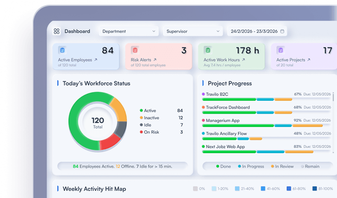
TrackForce brings working hours, active and idle time, attendance patterns, application and website usage, workload information, productivity trends and reports into a central workforce view. Managers can use these signals to investigate delivery changes, workload imbalance and workflow friction.
The platform data should sit beside role-specific outcomes such as quality, timeliness and customer impact. That combination creates evidence for better questions without asking one activity metric to represent an employee's total contribution.
Explore TrackForce workforce analytics software to assess how team visibility, productivity analytics and reporting fit your management workflow.
Build a Dashboard for Decisions, Not Surveillance
Effective software for tracking team productivity in dashboards does more than count activity. It connects outcomes, quality, delivery, workload and work patterns so managers can identify the reason behind a change.
Start with nine balanced metrics, define their limits and review trends with employees rather than judging isolated events. A dashboard succeeds when it helps the team remove a blocker, rebalance work or improve a result.
Frequently Asked Questions
What should a team productivity dashboard include?
It should include outcome completion, quality, on-time delivery, cycle time, workload balance, focus or fragmentation, activity trends, tool usage and a role-specific customer or business result.
What is the best metric for team productivity?
No single metric is sufficient. Completed outcomes provide a strong starting point, but managers should balance them with quality, timeliness, workload and business impact.
Can active time measure productivity?
Active time measures recorded computer activity, not the quality or value of completed work. Use it as diagnostic context alongside tasks, workload and outcomes.
How often should managers review productivity dashboards?
Managers can review operational exceptions weekly and broader trends monthly. Avoid reacting to isolated daily changes unless they indicate an immediate service, safety or security issue.
What should software for tracking team productivity in dashboards avoid?
It should avoid opaque universal scores, activity-only leaderboards and unnecessary personal data. Managers need transparent definitions, proportionate access and enough context to investigate before acting.
Similar blog you can explore
Start Your 30-Day
Free TrackForce Trial